Yesterday I was at Leaflet Missal Company in St. Paul, Minnesota. The Church goods section there, run by John, can provide priests with the best traditional stuff.
John of Church Goods put out all the US editions of the new, corrected Roman Missal so that anyone stopping in could kick the tires, as it were. BTW… John of Church Goods will meet or beat any price you call him about.
Also, John of Church Goods provided me with some notes about the missals written up by a local priest and friend nicknamed “The Liturginator”.
First, the Notes. Then, some photos.
Notes of The Liturginator:
When cost is not a factor here are my rankings for the various U.S. Altar Editions:
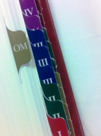
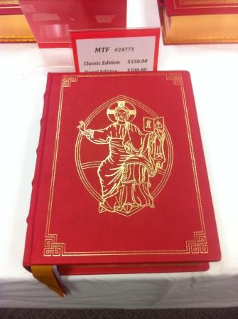
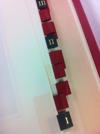
1. MTF Regal Edition (Superior binding, excellent art, leather tabs of proper size, properly placed and not too many, easily a companion to the Evangelarium of the same publisher)
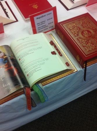
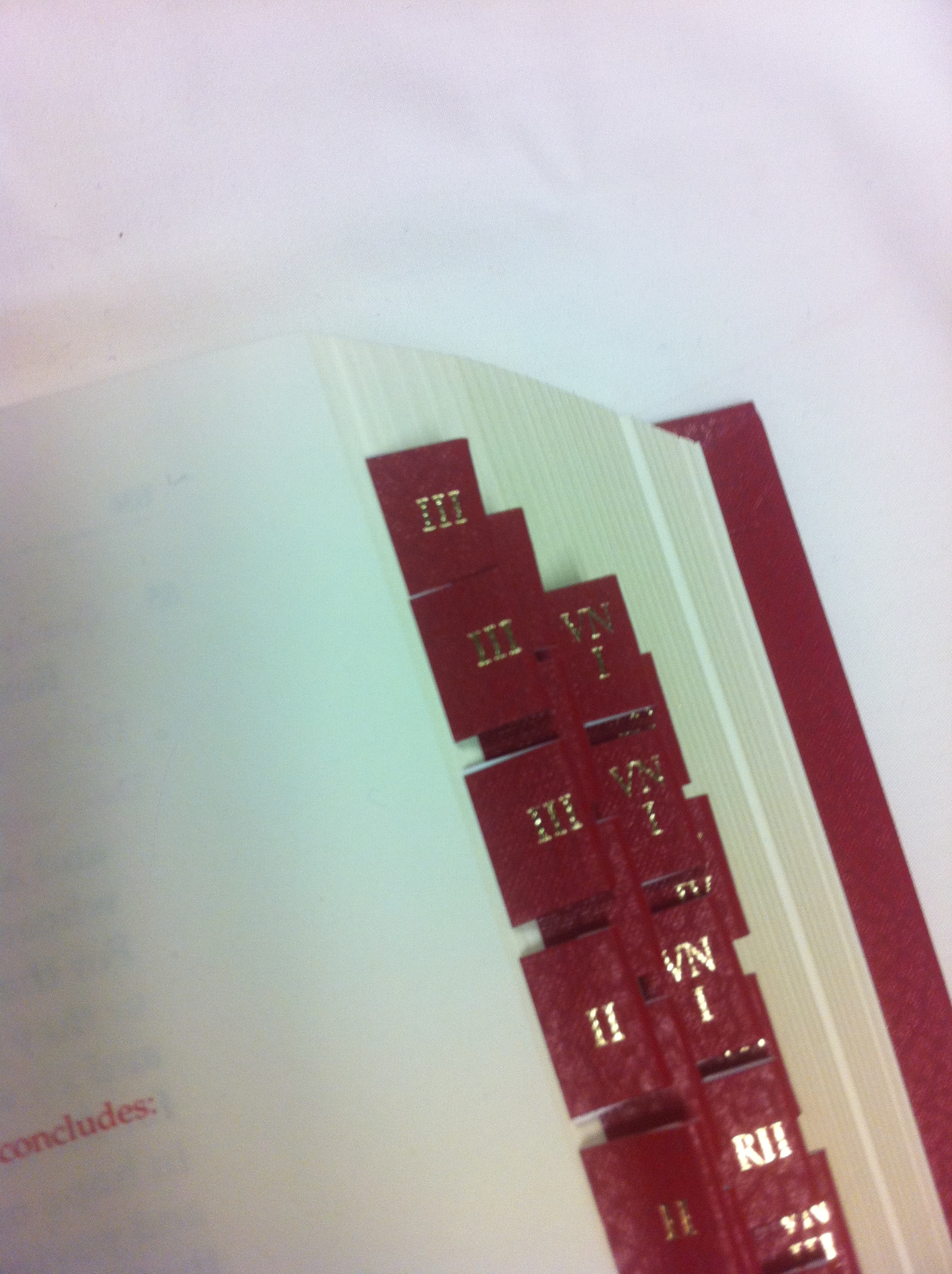
2. Magnificat (Excellent binding, excellent art though I prefer finished pieces to the pencil cartoons offered, “cartoon” here is offered in the sense of a fresco artist who makes a cartoon first before beginning the actual fresco – the most of all editions, tabs disappointing but not the worst – many must be self adhered)
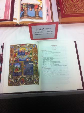
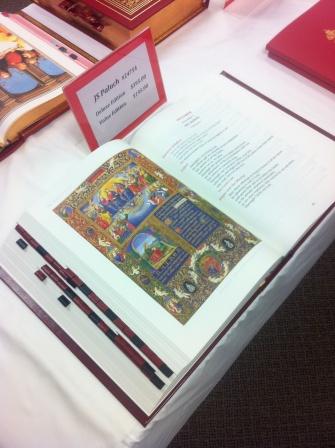
3. JSP Deluxe edition (Binding sound – cover art not as bad as advertisements indicated, superior art but not as much, largest sized musical notation, appreciated that the Our Father version A based on the standard chant at least appeared in the appendix, good leather leaves, thought the first one for the Roman Canon should have started one page earlier and the communion rite section tabs should have continued ascending after EP 4)
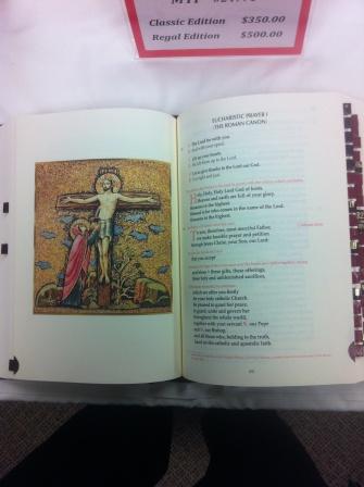
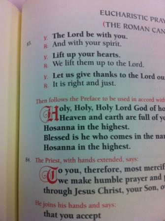
4. Catholic Book Deluxe Edition (Binding much better than expected especially the spine, disappointing continuation of cover design though, good art for full page panels, the extraneous clip art within is a major disappointment as are the special characters, bad placement of art next to the Eucharistic Prayers, opposite page of Roman Canon should be a crucifixion scene and not the Last Supper, no noticeable improvement to tabs, same fonts as older editions so some priests will like this out of habit)
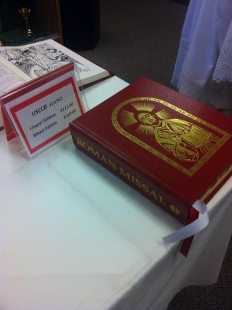
5. USCCB Edition (Standard binding, good art throughout, too many tabs)
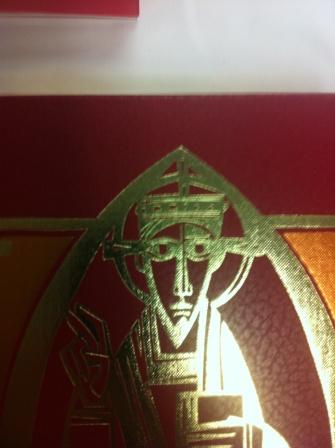
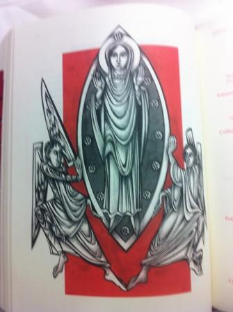
6. Liturgical Press (Standard binding, the art is original, in my opinion it is better than the LTP edition, though let me say I still appreciate Matthew Alderman, but if they had drawn from the Beuronese School of art as found in many of the Benedictine Abbeys throughout the midwest they would have a much better product – the mosaics of the Benedictine Convent in Clyde, Missouri or the found at Conception or Richardton or some of the remaining images found in the Old St. John’s Abbey Church in Collegeville now known as the Great Hall would have made this book much more competitive with the art of the top tier editions, tabs were fair)
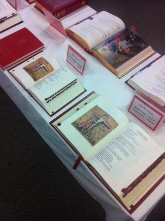
7. LTP Edition (Standard binding, Actual Cover Art ranks higher than all but two editions, the missal art seems too stylized for general consumption but I appreciate that it is original – worst placement of Crucifixion scene, there was no art next to the “Te” of the Roman Canon, the page was blank, and Crucifixion scene was placed next to EPII – I don’t have a problem with art next on the left side of EPII, but to not have it next to the Roman Canon is unforgiveable, the tabs were too big and too plastic) Overall I held out greater hope for this edition based on some of the previous advertising I had received, but after holding the book it was the biggest disappointment of all)The omission of a Latin Ordo Missae with seasonal propers was a major disappointment overall and I first I thought it was the decision of some publishers, but I soon realized that this was not the case. I would like to see a fully Latin/English Edition, The Magnificat Edition began to use two columns on each page in its section containing the GIRM – using two columns in a similar manner for the rest of the Missal would make this possible without the book being too fat, for traveling and Masses at nursing homes, I will be purchase a large print hard bound Daily Roman Missal from MTF as I currently do since not only does it incorporate a great deal of latin, but the readings are included as well all in one book, for tabs I place in 3M sticky flags of the narrow kind. They work very well. For those who are adept at public speaking of the more complex English grammatical constructions there is no need for sense lines so more space is available per page. Based on the ICEL music website I thought there would be many more latin chant incipits for the Gloria)
Now my photos from my phone.
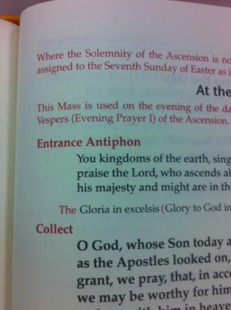
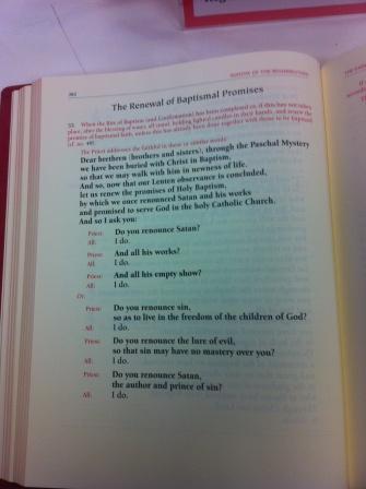
You should be able to keep straight which edition is which. I tried to shoot a photo of the tag as I started looking at each different book. I was told by John of Church Goods that if you find a better price on any volume, he will match or beat the price. Use Leaflet Missal when you can.
If you want to see a larger version (adding the links would be a bit tedious) just open the image in a new window and add “_lr” after the number and before the “.jpg” For example, “11_10_22_missals_47.jpg” becomes “11_10_22_missals_47_lr.jpg”
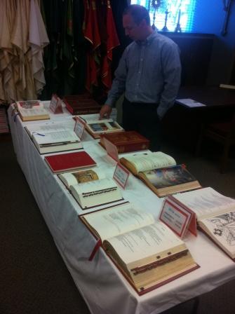
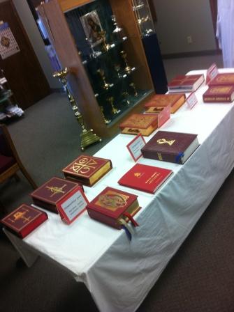
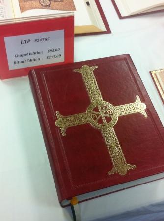
LITURGICAL PRESS
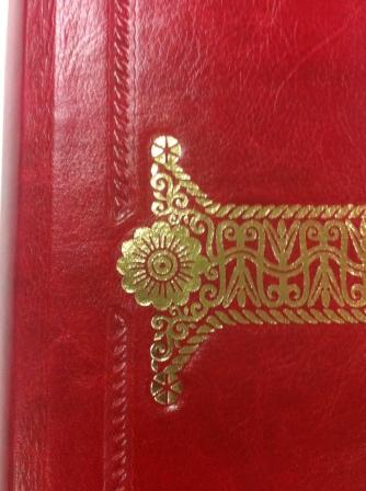
MTF
MAGNIFICAT
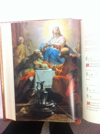
CBPC
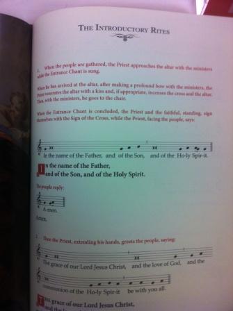
LITURGICAL PRESS
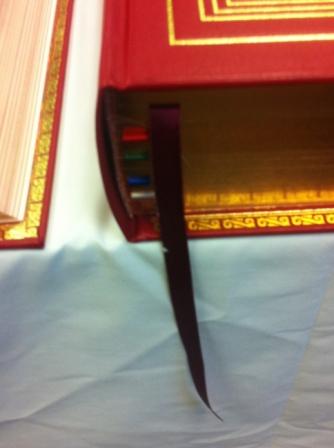
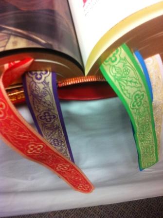
MAGNIFICAT
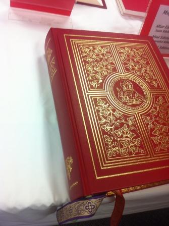
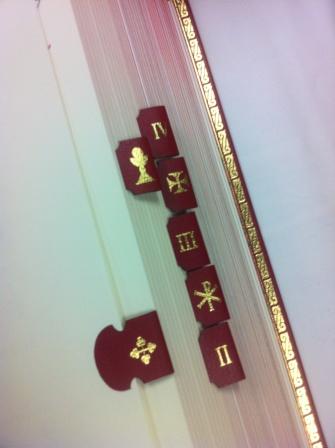
CBPC
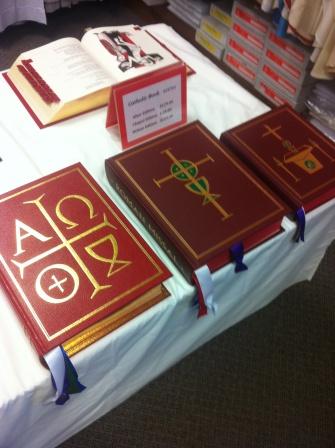
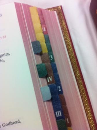
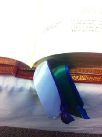
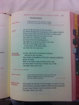
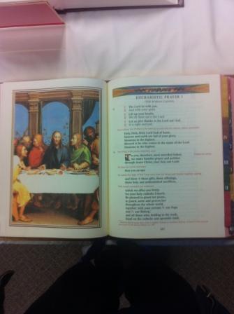
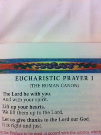
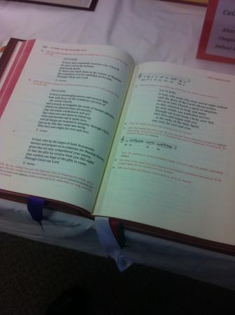
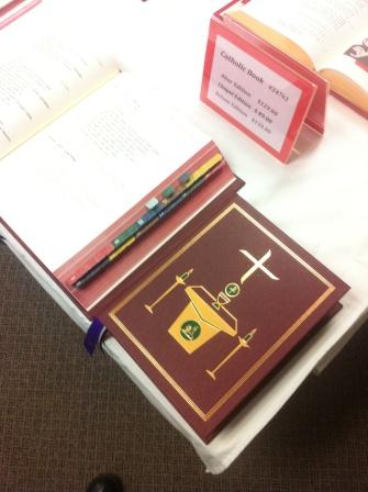
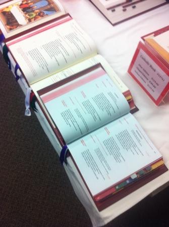
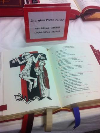
LITURGICAL PRESS
PALUCH
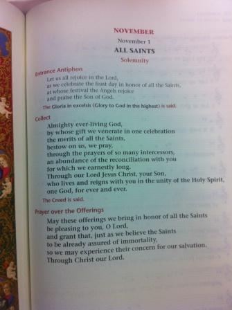
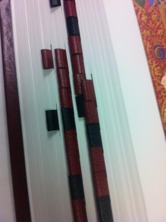
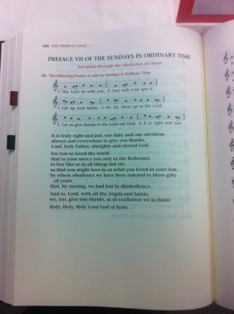
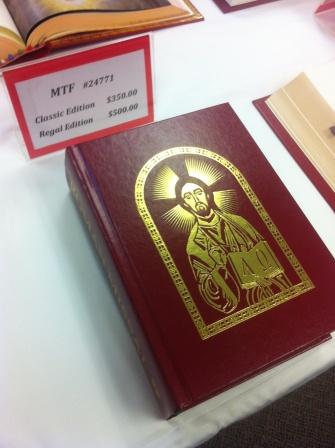
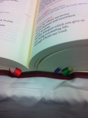
MTF and USCCB
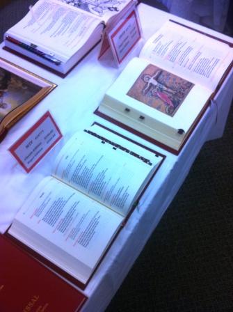
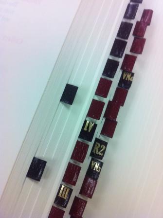
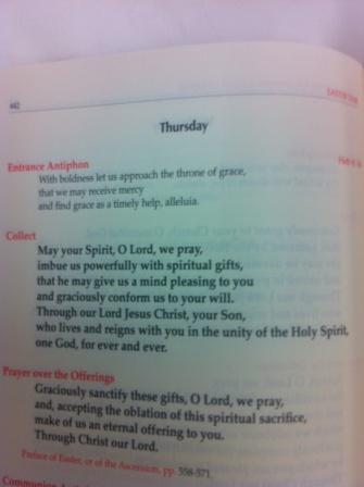
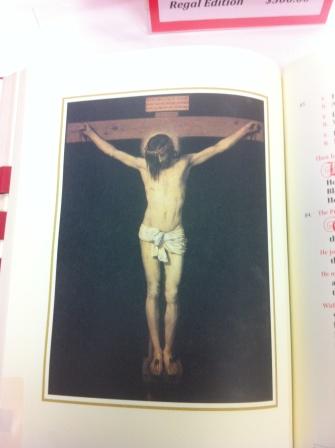
My choices.
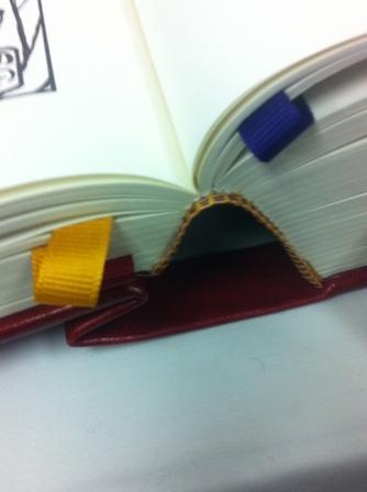
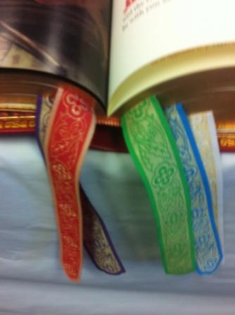
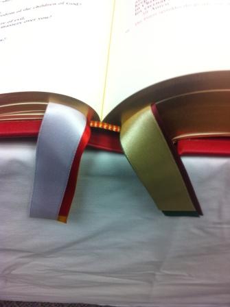
Magnificat large edition for the altar, with the simpler ribbons or the Paluch.
He did not have yet the chapel edition from Magnificat, which I think is the one many priests are hoping soon to see. Fewer illustrations but smaller format.













4. Catholic Book Deluxe Edition . . . . . bad placement of art next to the Eucharistic Prayers, opposite page of Roman Canon should be a crucifixion scene and not the Last Supper
Sufficient reason to look to another if you’re buying a gift for a priest? [It could very well be reason enough.]
Wow, that is a lot of pictures!
“The omission of a Latin Ordo Missae with seasonal propers was a major disappointment overall and I first I thought it was the decision of some publishers, but I soon realized that this was not the case. ”
Does this mean that such is a USCCB or ICEL mandate or instruction? I remember Fr. Z mentioning something regarding this in a post a few days ago. What a regrettable decision.
I ordered several copies of the Magnificat chapel edition. My plan is to use those for now, wait until all this shakes out, then order some larger, altar editions from whoever seems to be the best.
My thought, several months ago, was that there would be typesetting errors and other problems in the rush to get things out; plus, all we had to go on was flyers and websites, not actual books to look at, or user reviews. I’m glad I waited.
Fr. Fox!
I offered to buy our parish the MTF Regal edition altar missal, but my pastor said the same thing: get a cheap one now and wait to see how this thing shakes out.
I was confused by this comment. Can you explain more what you mean, and what you expect to change?
I donated the Liturgical Press version to my parish. It was Father’s choice, though I didn’t think too highly of the art by comparison with some of the others. It was a shame, as Fr. Fox notes, that we couldn’t pick up the missals and really compare them earlier. I’ll talk with my priest about upgrading it if he’s not satisfied with the missal after a few months.
It will be great this Missal is now being used with Mass offered Ad Orientem!
Rich:
Well, I figure with all the rush, the publishers are likely to make mistakes typesetting the pages.
Also, they may get feedback that some of their design decisions may have been ill-considered, and revise them.
If you look at the articles and reviews already appearing about the new missals, you’ll see comments precisely about the wisdom of some of those decisions.
While I don’t expect the omission of the Latin texts to be corrected that quickly, I do think that will be fixed before too long.
What fantastic photos, but hate the modern art in the Liturgical Press editions. My, what choices.
For those in Great Britain, the Catholic Truth Society of England has published some of the missals for lay use and these are great. The altar missal will be spectacular, apparently, and time is being taken over it. http://www.cts-online.org.uk/acatalog/info_RM01.html
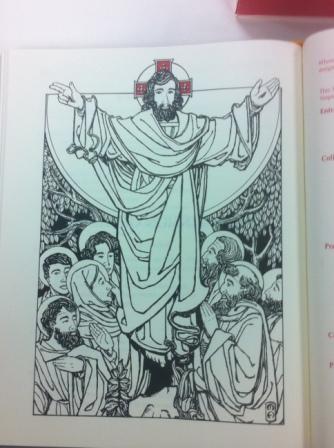
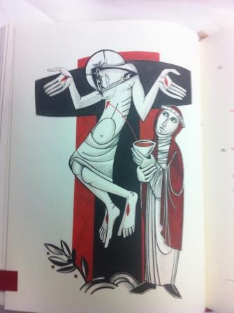
The “artwork” of the Crucifixion in the Liturgical Press offering (above) is simply an abomination. I will probably have nightmares tonight, flashbacks to the traumatic experiences of having such egregious “modern art” inflicted upon us in the ’60’s. I dare not let my own children catch a glimpse of it lest their faith be weakened and their minds warped.
For all I know it may have been drawn 45 years ago, but whomever signed-off on publishing it now ought to be horsewhipped. If it’s typical of the rest of the illustrations in their edition perhaps we should escalate to burning at the stake!
Seriously, one cannot look at such a thing without thinking that they are trying to make a statement, one decidedly not in support of the Benedictine liturgical movement…
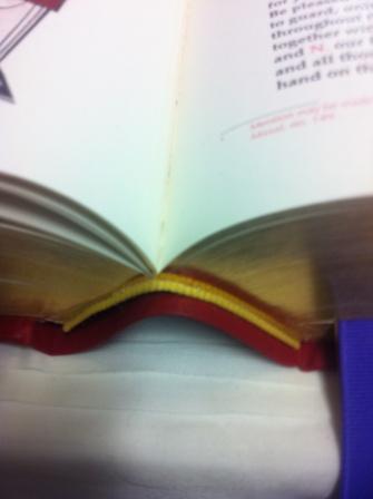
Our parish bought the LTP both altar and chapel editions. Our deacon was disappointed that the binding did not lie flat, as our old sacramentary does, and also that the text runs too close to the gutter on the page making it sometimes hard to see. Maybe this will correct itself as the binding becomes more relaxed from use.
The artwork in the Liturgical Press book is in what I have come to call “Benedictine moderne.” It is found in the publications of many of the modern abbeys. As well as in frescoes, statuary, etc. I look the other way unless I can’t, it contaminates some of my oblate literature as well.
The books displayed seem to give lots of good varying choices depending on what a priest wants.
@maynardus,
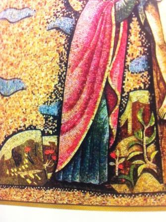
The artwork to which you object is a modern stylization of a traditional icon. I not only find the new version objectionable, but the original icon does not work in our culture, because Christ is depicted as if he were shrugging. It would be interesting to learn whether the first versions of this image precede our notion of shrugging.
YouTube video:
The New Roman Missal – Regal Edition Explained.
Has John at Leaflet gotten any Italian linen albs without pleats yet?
Speravi: How about asking him yourself.
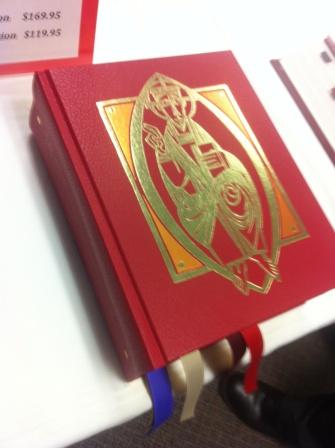
Move over, rich Corinthian leather. Here comes high-quality German red Genuine Leather.
Those of you in America have a great deal for which to be thankful. In my annexed little corner of Canada we have the following nightmare currently:
i. One publisher. The CCCB (Equiv. to USCCB). One.
ii. Generally poor artwork. Only available in two-tone.
iii. No standard tabbing. Each is to be done by hand, at the Parish.
iv. Poor paper quality – frequently used pages will deteriorate.
v. Poor ribbons. Within the last three years or so, we had an update to our Lectionary (we finally have one approved by Rome). The ribbons are already fraying. Much like my patience.
vi. Again, no Latin sections.
vi. And shipping for all of Canada does not begin until November 10th. No copies are available until then.
vii. A price disproportionately high to the product. The chapel edition is $125 (this is roughly the same in American currency), for example.
Have I mentioned that these will not even begin to ship until the 10th of November? For those of us in rural areas, this presents an even greater challenge, especially with any hope of prior preparation. This, is suppose, is partly the result of socialism. Other contributing factors will not be named, as this is not intended to be a mud-slinging.
Anthony Esolen has a good essay in First Things about the new translation of the liturgy:
Restoring the Words: The new translation of the Mass restores its beauty and splendor.
I just noticed a serious editorial mistake in a not often used portion of the MTF Missal. In the solemn tone text for chanting the Roman Canon, there is a page turn in the middle of the words of consecration for the Precious Blood.
Fr. Z, Sorry about the off-topic question.
I purchased a Chapel Edition from the USCCB for my own book collection. I am very pleased with it for the most part. Back in March when I ordered it I got a deep discount on it and that is why I choose it.
Charles Flynn, thanks for the link to the Anthony Esolen article!