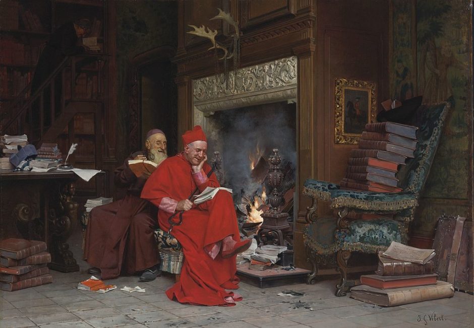
I might as well get on the bandwagon.
I think the Fishwrap needs a new Cracker Barrel style look, what say you?
Old

New

I dunno… we can do better. I like the first one better, but it is too small.
UPDATE:
From a reader:

UPDATE:
I would like other submissions, of course, but in the meantime… what the heck is going on with logos?
Remember when the sad Archdiocese of Detroit went from this to that?

Far worse than the restaurant https://t.co/1bdTRPv70i
— Michael R. Heinlein (@HeinleinMichael) August 22, 2025
Being from the Land of Lakes, I was exceptionally annoyed by the on the center. We quipped, “They got rid of the Indian, but kept the land.”

More submissions from readers…


Welll…


Ah shucks, I liked the old Fishwrap image. It had a clear and classic photoshopped-but-hard-to-tell look. The new one just looks like every AI image. Don’t Cracker Barrel the Fishwrap image! XD
If it ain’t broke, don’t fix it. I like the messy look of the current version.
Considering the fish as a holy symbol I am surprised the newspaper hasn’t spontaneously caught fire.
Not a fan of the AI generated stuff. There’s a certain charm behind the classic photoshop look. Maybe I’ll try dusting off the ol’ skills this weekend and see if I can come up with anything worthy.
When I see and hear stuff like this, I remember the demise of Sambo’s restaurants, which was named by combining the names of the two founders. The name was misinterpreted by many.
Several relatives including my dad came from Oklahoma, which years ago was Indian territory. Several cities and counties have Indian names. People with common sense see this as history and it would be foolish (in my opinion anyway) to rename these cities and counties. Let’s not erase history.
Fish waste……
https://i.guim.co.uk/img/media/cee509aadf14be5ef241dc402f4dc5b23abac0ae/321_883_5976_3586/master/5976.jpg?width=700&quality=85&auto=format&fit=max&s=7a4e1efe6061e82eb5f9a997acb515ad
To really capture the Fishwrap brand, might I suggest Comic Sans for the headlines?